Aeriva
Is it safe to go outside? Air quality for any place on Earth, in one clear answer.
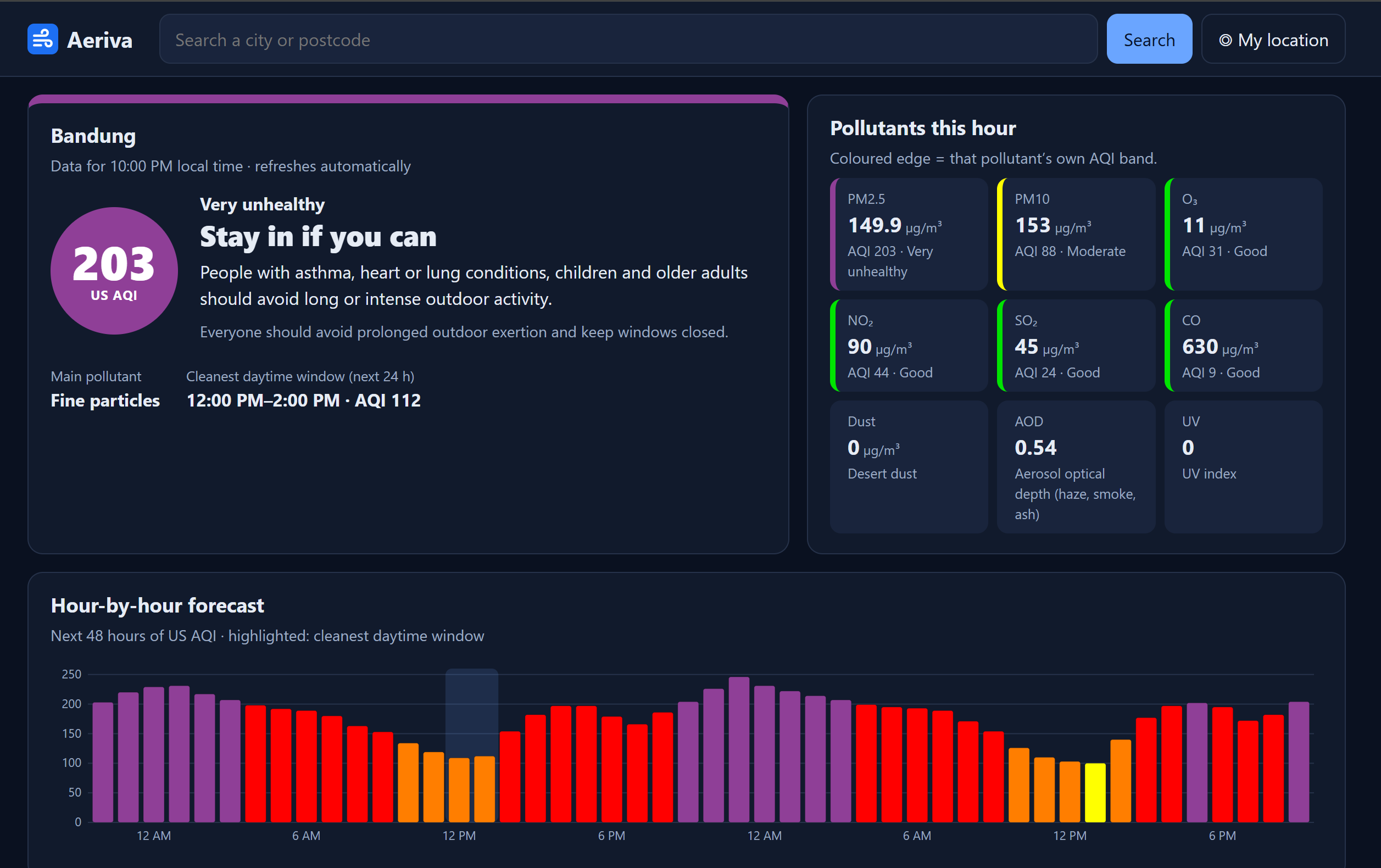
An air-quality dashboard that turns any place, postcode or map click into a clear verdict: go outside, take it easy, or stay in. It shows the US AQI, a 48-hour forecast, 7-day pollutant trends and a world map. Inspired by the volcanic eruption in Indonesia. Values are mostly model estimates from Copernicus (CAMS), with measured OpenAQ station readings where available.
Visit WebsiteProject Gallery
Using This Project
What it's for
Quickly checking whether the air is healthy enough to be outdoors, especially for people with asthma, children and older adults, and comparing air quality between cities worldwide.
How to use it
- Open aeriva.winstonnk.com.
- Search a city or postcode, use your location, or click the map.
- Read the verdict and current US AQI.
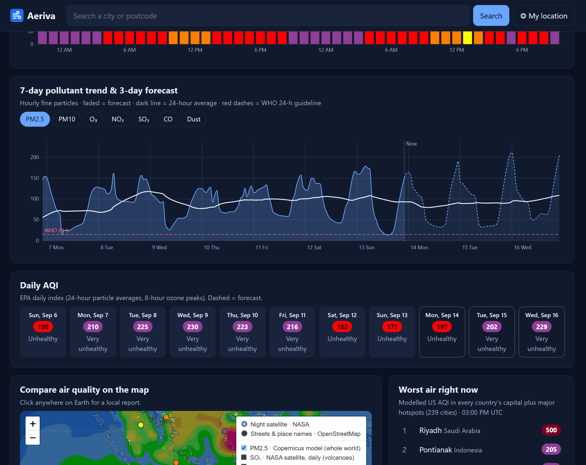
- Check the 48-hour forecast and 7-day trend.
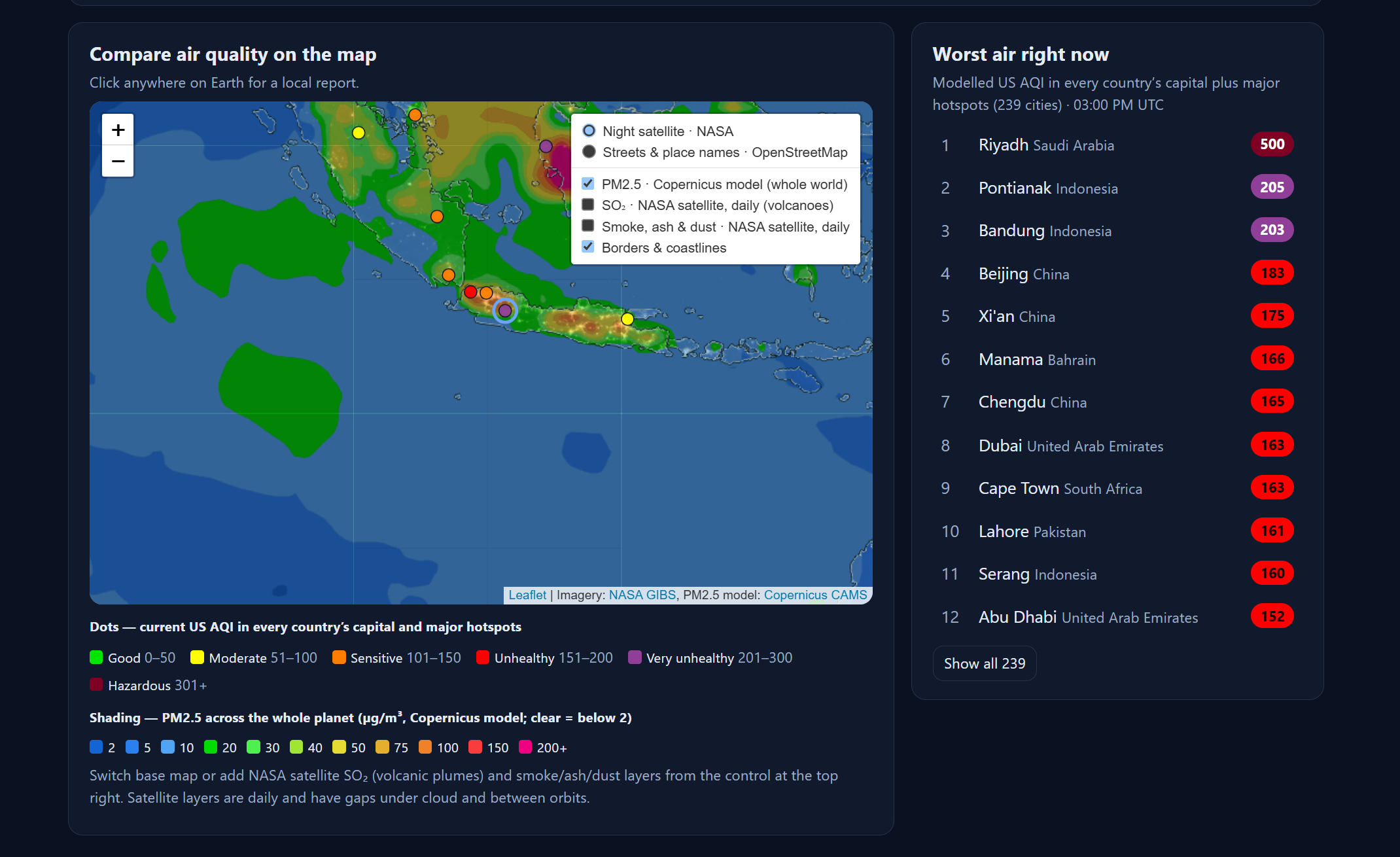
- Use the map layers to compare regions.
Highlighted features
- Go outside / take it easy / stay in verdict based on the US EPA AQI
- 48-hour AQI forecast with the cleanest daytime window
- 7-day pollutant trends against WHO guidelines
- World PM2.5 map with NASA satellite SO₂ and aerosol layers
- Worst-air ranking across 239 cities in 196 countries and territories
- Measured PM2.5 from nearby OpenAQ ground stations
Documentation & Proof
Reports, case studies, or screenshots that back up this project. Open the attached file (PDF or image) to view the proof.
Documentation — coming soonLessons Learned
Check what users actually see: map tiles returned 200 OK but carried an "API KEY REQUIRED" watermark.
No free source measures air quality everywhere, so I combined model data with real stations and labelled which is which.
Data can challenge assumptions: Jakarta's pollution was driven mainly by fine particles, not volcanic SO₂.
Free APIs have limits, so batching and caching mattered as much as the features.
Not every project needs a database: an in-memory cache replaced the planned MySQL.